- Communcation Concept
- Corporate Design
- Corporate Language
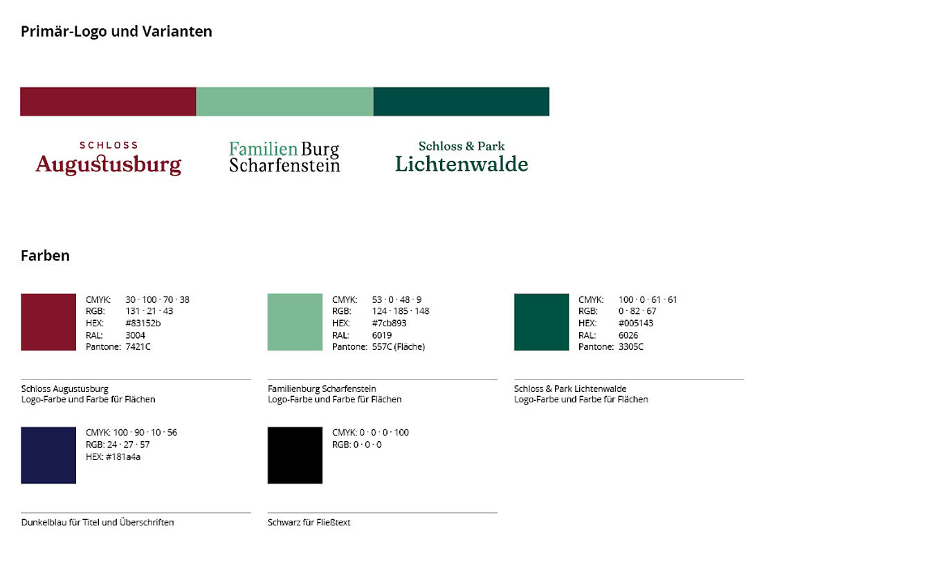
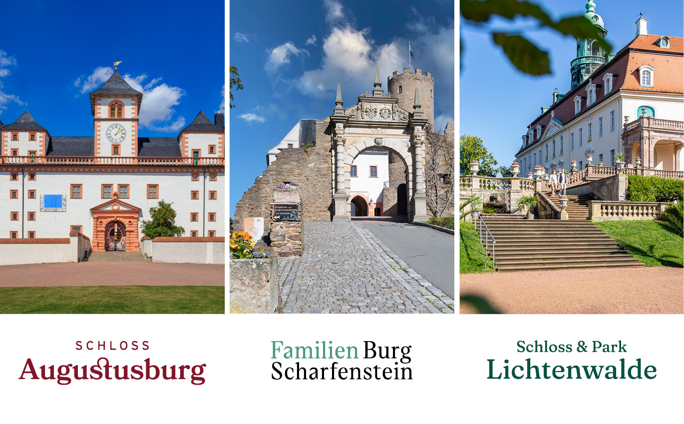
Augustusburg/Scharfenstein/Lichtenwalde Schlossbetriebe gGmbH manages and markets the three destinations mentioned in the name under the tourism umbrella brand The Three Worth Seeing. The three establishments differ greatly in character, variety of offerings and tourist infrastructure. But in the competition for the visitors' favor, uniqueness and clear communication are decisive advantages.
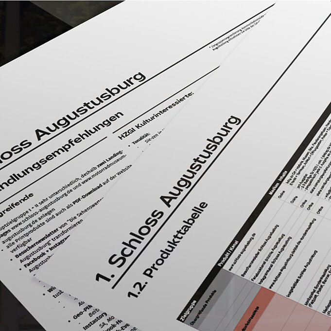
Managing Director Patrizia Meyn asked us to evaluate and reposition the three destinations and the umbrella brand. We start with a potential analysis. Internally, we determine a current self-image in the workshop, and externally we position the properties in comparison to the competition. Conclusion: The locations are highly differentiated in their target group offerings. A central umbrella brand cannot therefore communicate sufficiently with the target group. As a result, we simultaneously develop the overarching communications concept for future B2C and B2B marketing as well as four corporate designs and corporate languages.
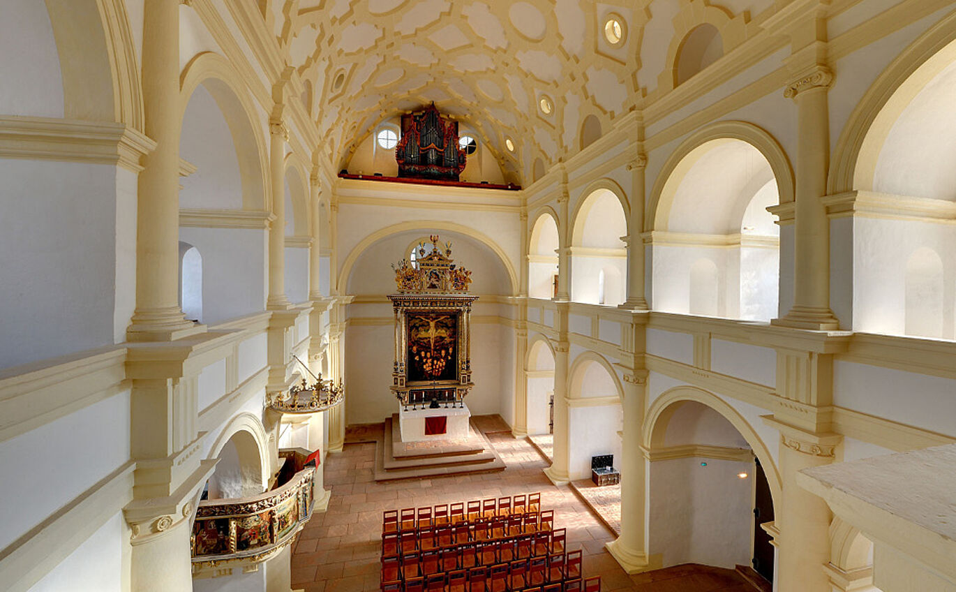
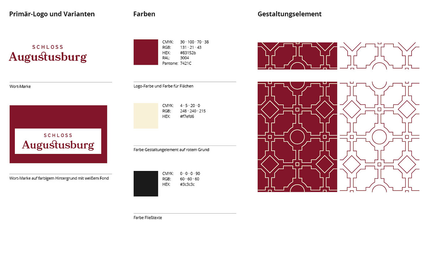
Augustusburg Castle already has a strong positioning and distinctive communication. Therefore, we only make minimal adjustments in terms of design by optimizing the house color and adding a graphic element that we had already developed for the 450th anniversary of the castle. The ornament is taken from the ceiling vault of the castle chapel – in keeping with the ideal of Renaissance architecture with its adherence to symmetry and strict proportions.
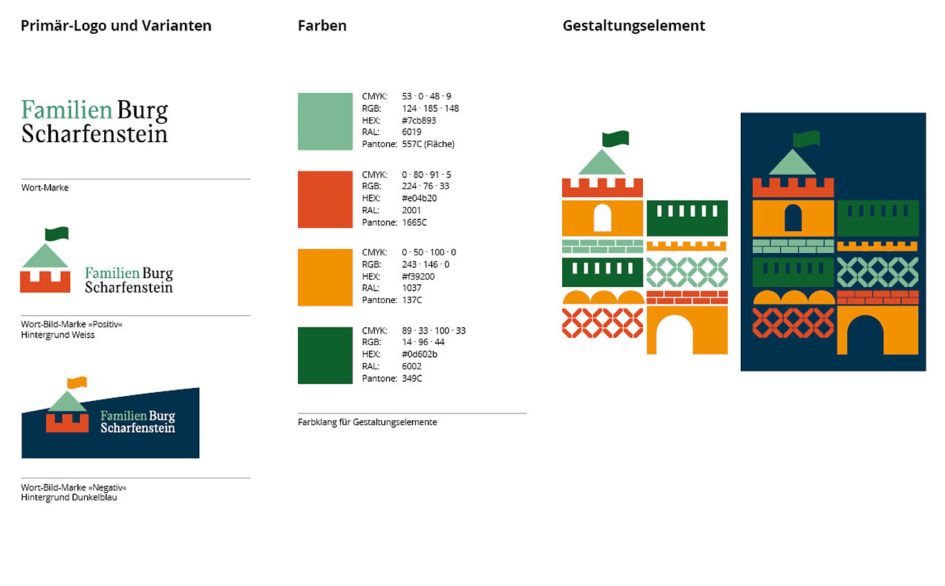
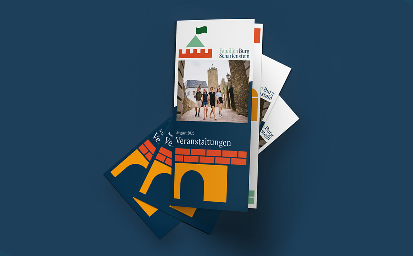
We renamed the knightly Scharfenstein Castle as Scharfenstein Family Castle in order to link it as closely as possible to the main target group. The striking structural character of the castle inspired us to create design elements that can be used variably and playfully. The color palette of the modular principle is also derived from the building. From now on, the language is just as rebellious and playful as a real knight's castle is.
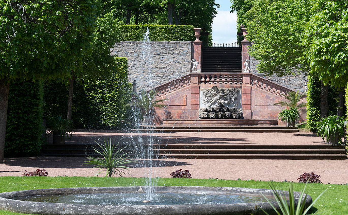
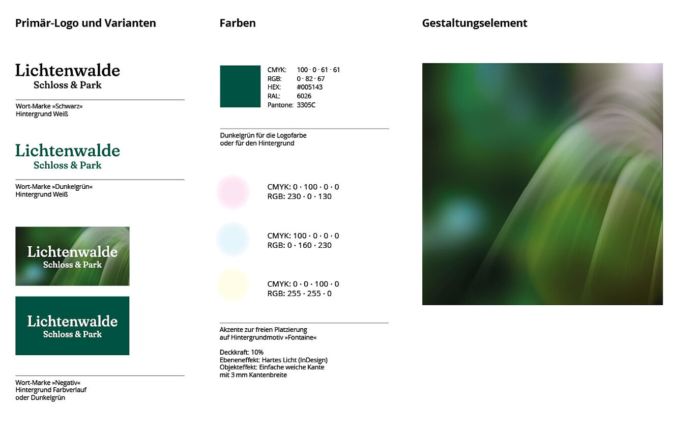
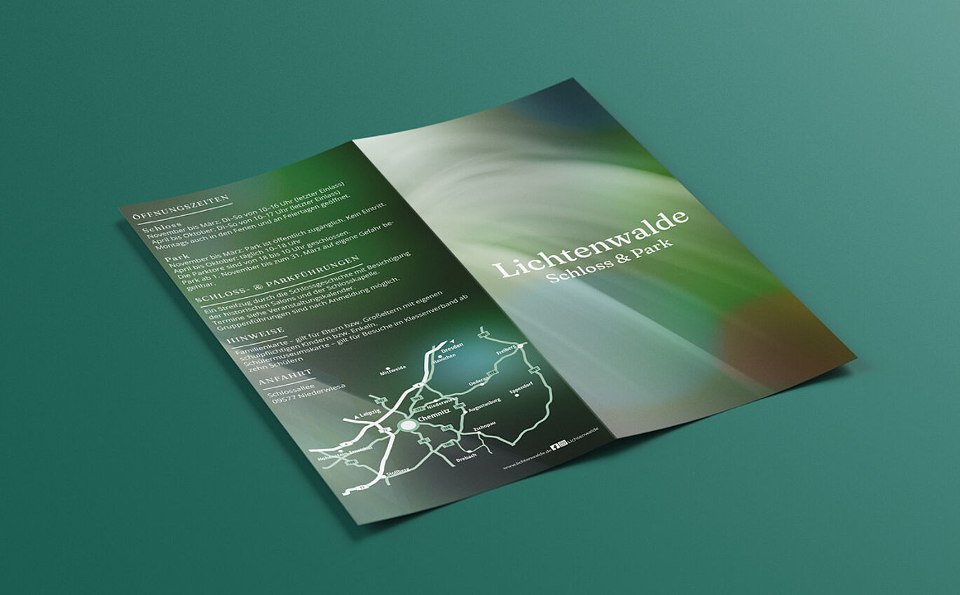
Lichtenwalde Castle & Park is a delightful Baroque ensemble not far from Chemnitz. For over 150 years, a good 300 water fountains have been attracting visitors to stroll in the park. We visually translate the magical-mystical character of the place into a background graphic that captures the mysterious atmosphere. Delicate fountain fountains stand out in the foreground of the key visual, accentuated by points of light - Lichtenwalde, after all. The language is poetic and contains many references to fairy tales.
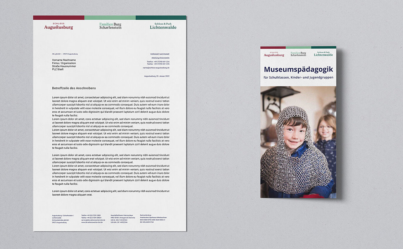
Cross-location communication with B2B target groups (tour operators, educators, press) remains with Schlossbetriebe gGmbH. The company uses a reduced corporate design derived from the word marks and primary colors of the three site designs. The language is equally clear and designed to convey information efficiently, yet still lively.