- Information design
- Packaging Design
- 3D
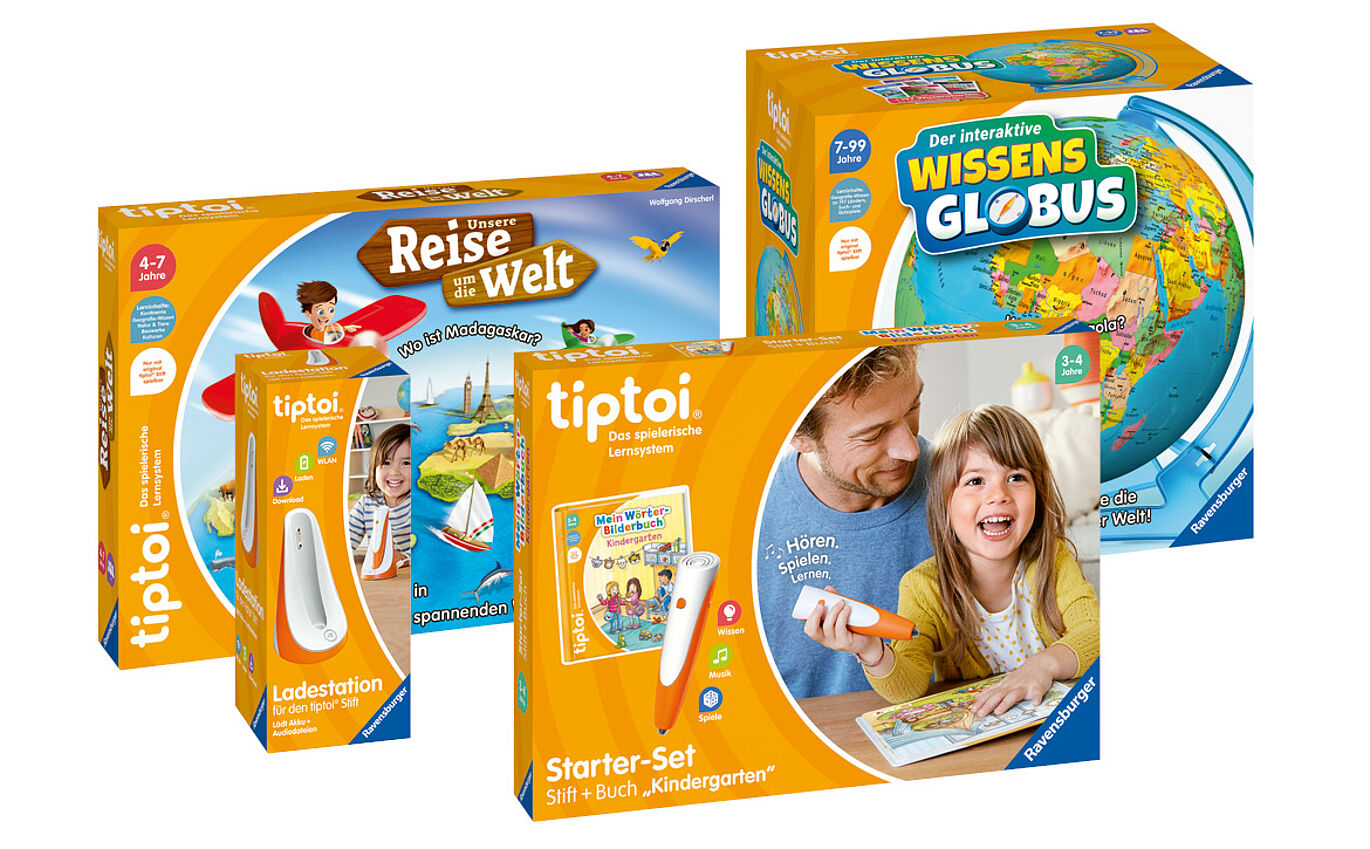
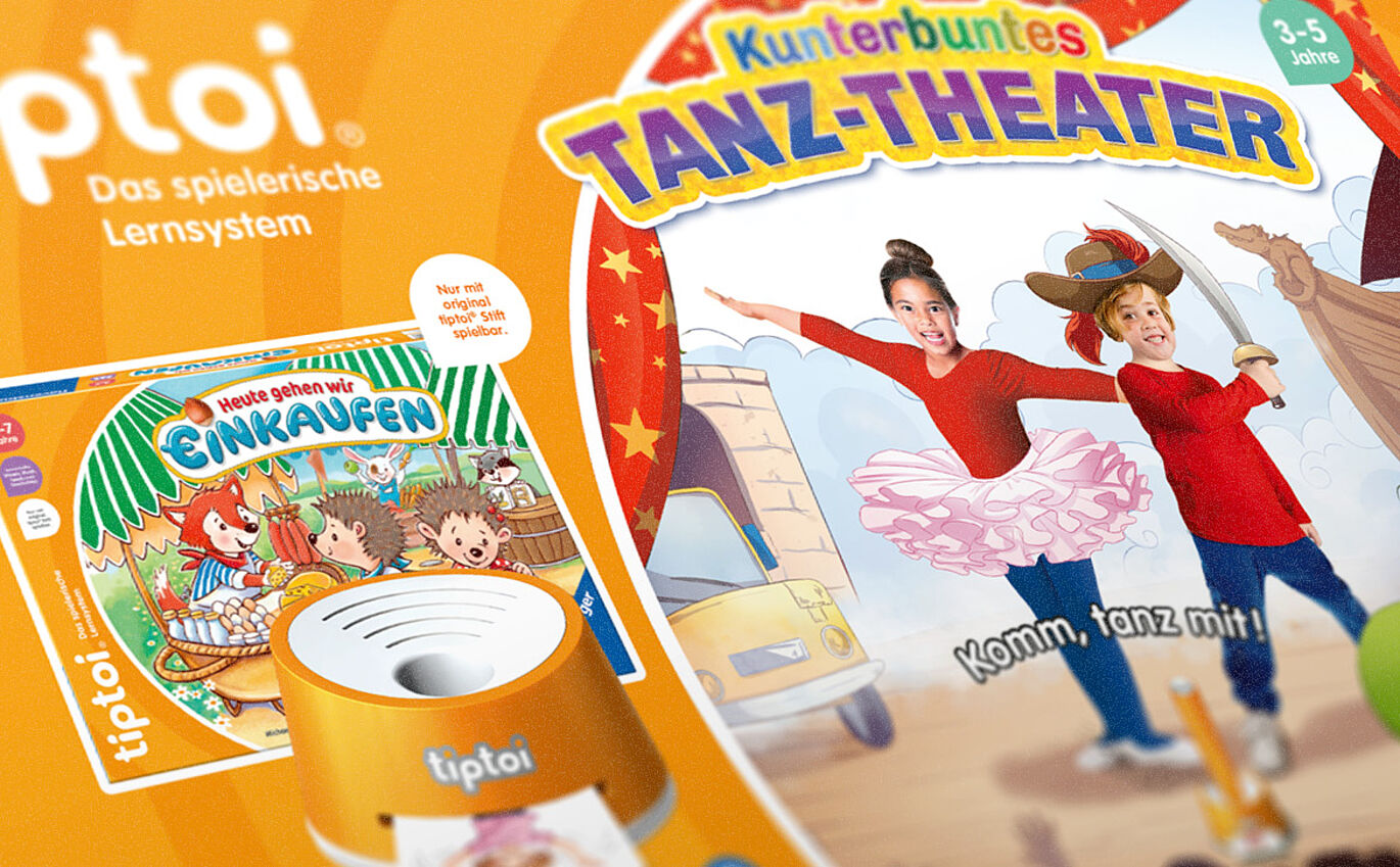
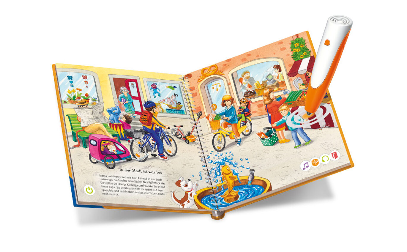
For over ten years and a million units sold, tiptoi has been an integral part of children's rooms. Ravensburger asked us to redesign the entire packaging to achieve a higher immersion and more emotional appeal. The redesign was tested throughout its various stages of development by the target demographic. Our revised design clearly and authentically reflects the educational, haptic edutainment that tiptoi stands for.
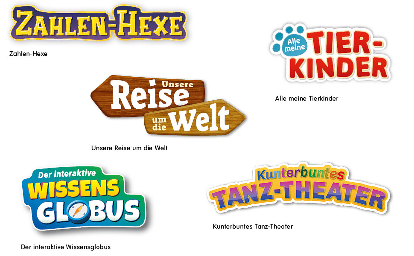
For an extended market research process on the part of our client, we developed five graphically different approaches for the new packaging layout. Our challenge: To create a diversity of elements (mandatory information, info icons, multilingual text modules) and assemble them in a memorable design framework. This framework should be flexible enough to handle a variety of graphic content. At the same time, this framework should be applicable to end products with different formats and design areas (starter set, single game, book formats).

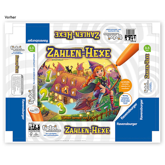
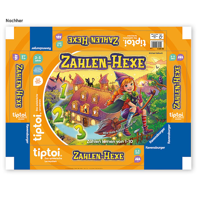
After testing the products, two favourites stood out. We developed them further and sent them in for the final round of market testing. Ravensburger decided on the winning version, which we then polished into a visual toolbox for the entire range of products. Ravensburger's inhouse team now uses this open template data in their publishing house.
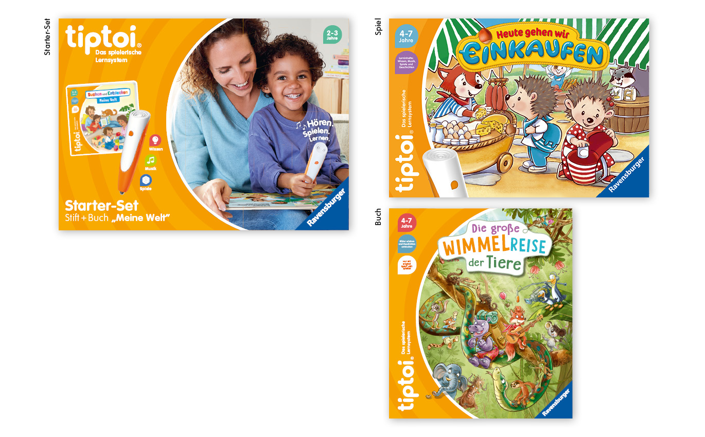
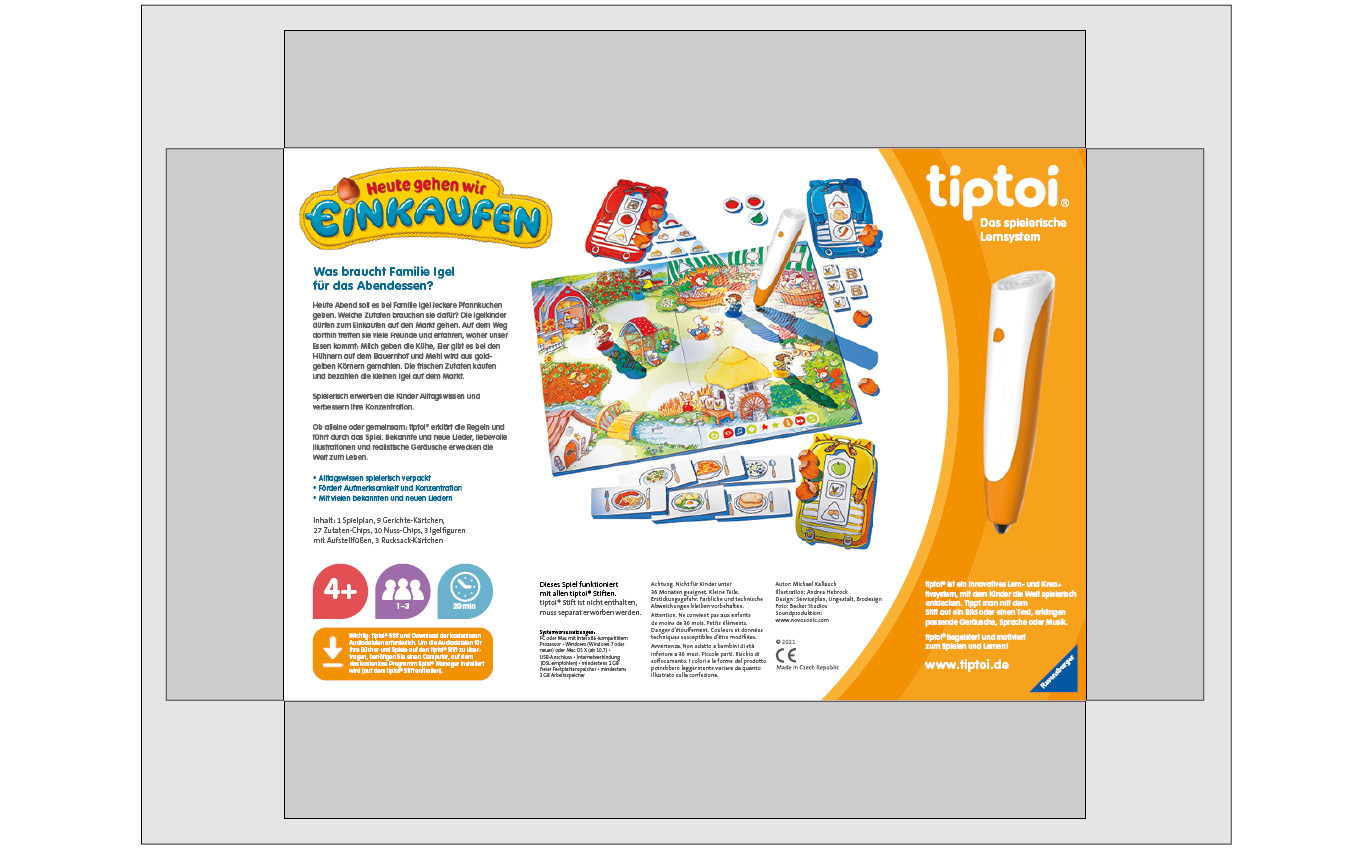
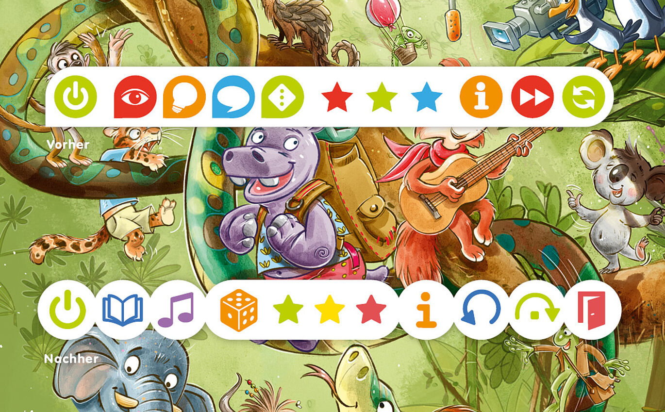
We then implemented the final design on the entire packaging. We had to decide how much information to show on the narrow side panels to recognize and assign the product. Also, how much information is needed on the back to understand the game principle. Working alongside game editors and marketers, we use design to find visual solutions for image, graphic, and text content.