- Workshops
- Brand strategy
- Corporate Design
Founded in 2008, the scope of services and customer base have grown steadily. Originally a two-man graphic office for printed matter, more and more corporate designs were designed in our first few business years, so that in 2012 the first brand agency rebranded. In the years that followed, our assignments changed to include comprehensive communication support, image campaigns and spatial design assignments. Not only has the scale of the orders developed, the clients, team and expertise have too. In 2018, it was time to question our work again - this time together as a whole team.
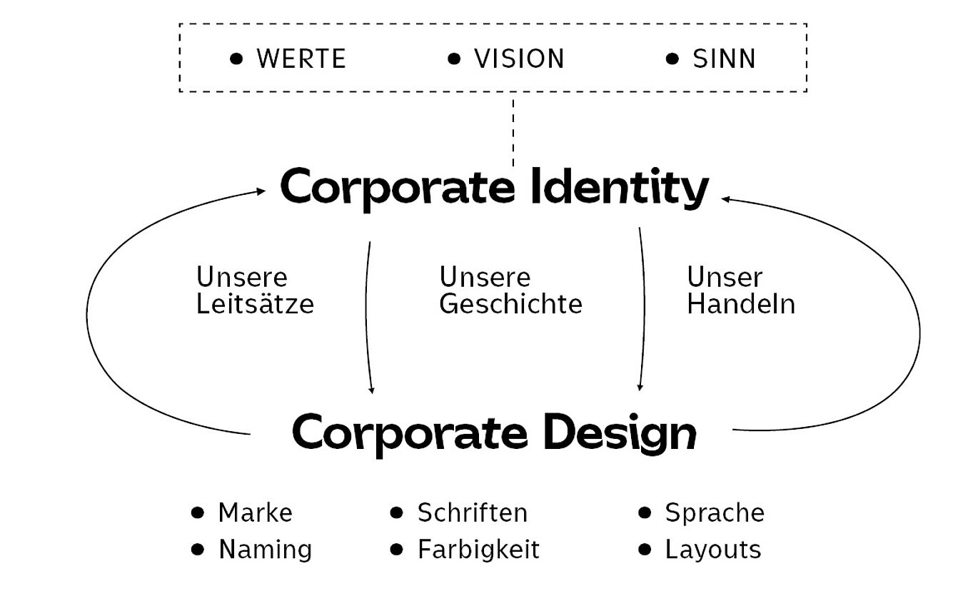
Our new corporate design is the visual result of a transformation process that began in 2018. Through internal workshops, we faced our disorder at the time and gradually answered the big questions. It was about values, meaning, narratives, self-image, range of services, working methods, and togetherness. Our ungestalt identity, which we had lived vaguely to date, has become something tangible. Our vision: We want to promote serenity in working through communication - for us, every client, and partner.


From Ungestalt – Nur Marken im Kopf becomes ungestalt. Kollektiv für Kommunikationsdesign. ungestalt? Born as a spontaneous note in the academic years of the managing directors, the word has remained the core and companion of our creative journey over the years. Today we identify with this name more than ever: ungestalt means shapeless and full of possibilities. ungestalt is our starting point for every new project. unformed is self-deprecating and a reminder not to succumb to the professional habitus of a self-enamored agency landscape. For us, ungestalt also means constantly learning and being able to be satisfied without having to be perfect.
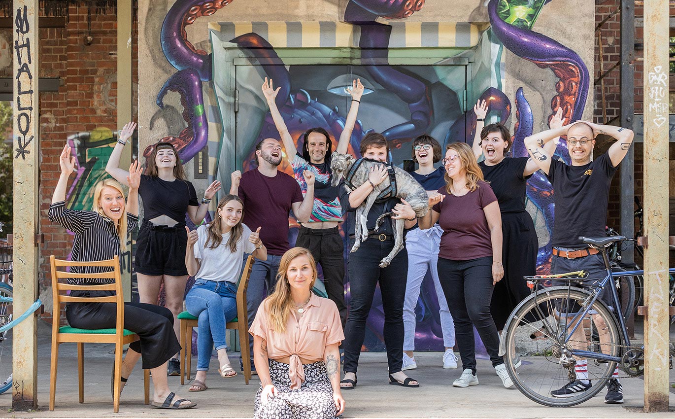
We are ungestalt: a team of unique personalities with individual strengths and approaches, which, depending on the assignment, always produce new results in an adaptive process and changing constellations.
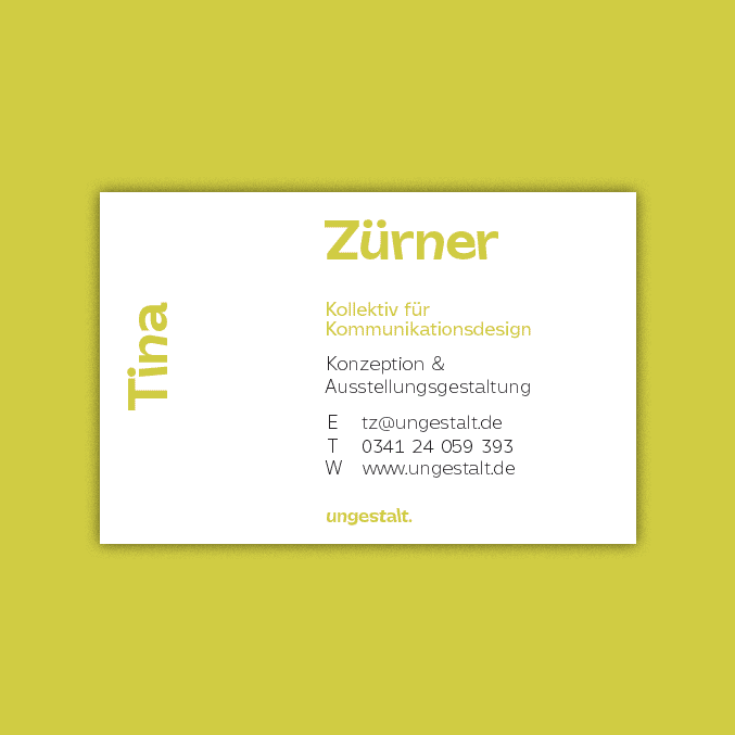
The previous combined word and figurative mark was replaced by a pure word mark: ungestalt is a central term and already very strong in terms of communication. That is why we decided on graphic reduction here. The new word mark is based on our in-house typeface that we developed and designed and, together with it, forms an inseparable unit in our appearance. It is now available to us in two size-optimized versions.
For selected applications, the word mark is used even more reduced: a simple u becomes our unmistakable signet.

 cases")
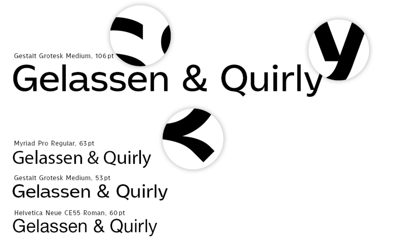
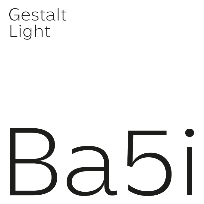
Our corporate font Gestalt Grotesk reflects our very own approachable, playful and process-like character with its clear, friendly, dynamic, and precise forms. The most pronounced cut deforms the letters and makes them dance. Their flowing movements are captured in a snapshot to form an energetic wordmark. We have expanded the font family to include additional weights. Now, we can use them in more places, such as in headlines or bodies of text.
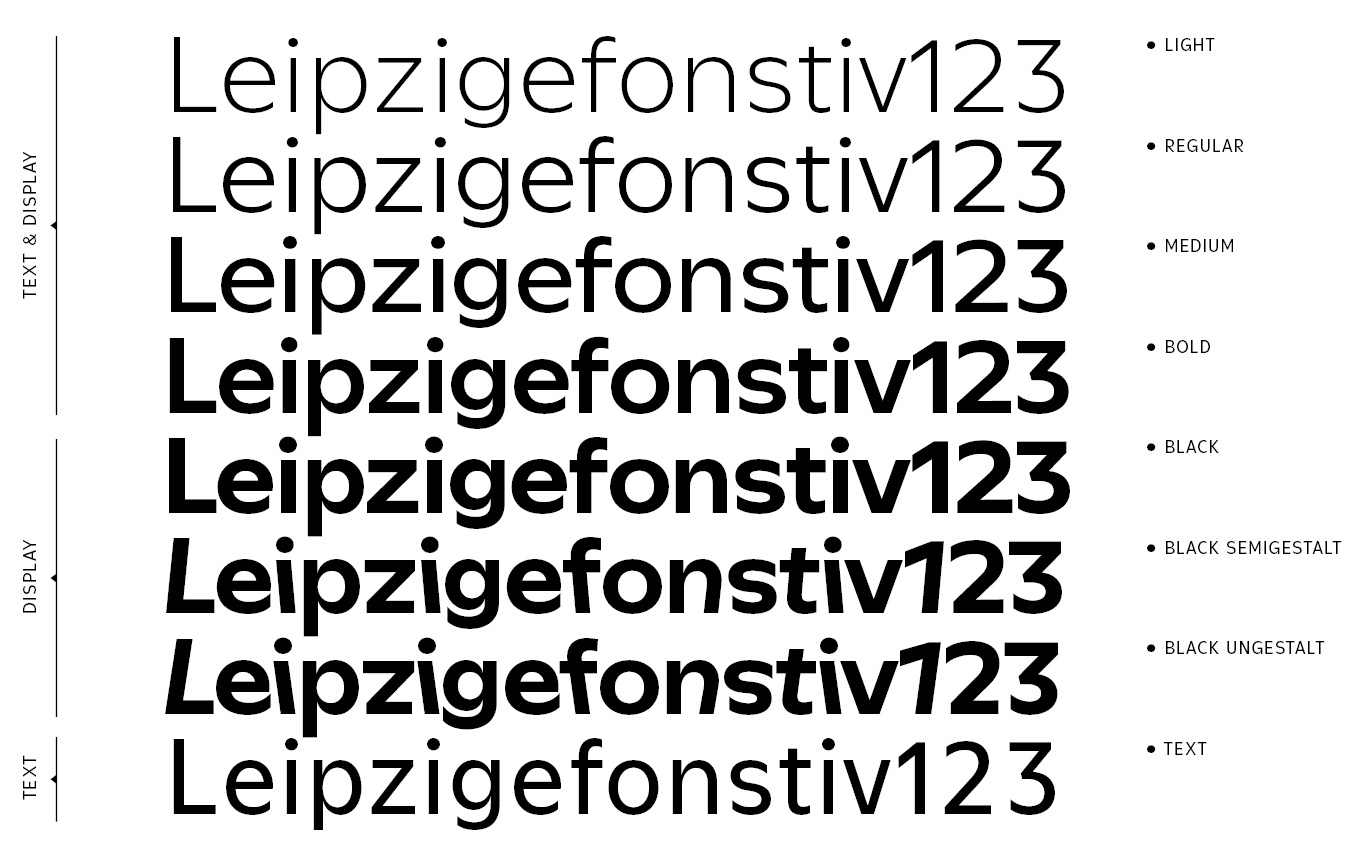


We give our corporate font an open and flexible design grid, allowing it to bring each of our communication products to life. We use the creative power of the empty spaces and stage the font in its extreme cut in bold headlines.
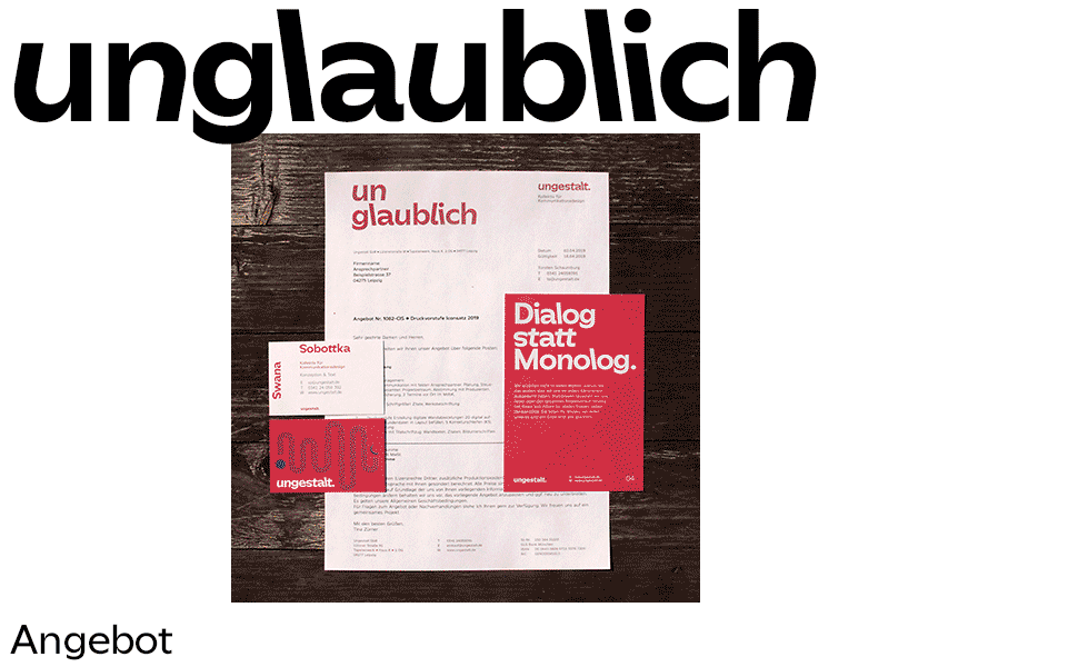
Another central element of our new self-expression is un-words. Across different visual environments, the product's purpose is given an adjective with the 'un' prefix as the title. We playfully reveal the communicative function of the medium, thus giving the viewer, and the object, an expanded scope. Playful professionals!


Hot Branding
⬤
Slippers
⬤Another integral part of our new appearance: we have decided on a variable choice of colours, because in our team everyone is unique, and together with our clients and network, we create a spectrum. This conceptual idea is implemented in a variety of ways: the right colour is selected depending on the communication purpose, area of application, and aesthetic conditions. Internally, everyone can communicate in their favorite colour and change it at any time. Since we also want to convey this freedom to the outside world, there is a continuous colour regulator on our website: each visitor can decide for themselves which colour they would like to see us in.


Corporate Culture
⬤
Postcard series
⬤We see ourselves as professional creatives. Nevertheless: Just like the tip of the iceberg, the professional role relates to the whole person - it shows only a fraction of the whole, which can and is much more. That is why we create space offline and online in the company in which holism is not only accepted but actively encouraged: Be who you are. Say what moves you Speak as you want. Wear what you like. And above all: Show what inspires you! In addition to everything official, this website also features our digital playground: The LAB (short for laboratory). Here both the collective and individual team members present their own projects, free work, matters of the heart, experiments, the unpaid, and the priceless.
Pixelethics
⬤
Album cover
⬤

Sticker series
⬤After a good year of internally restructuring of our corporate system and a few intensive months for the communicative relaunch, we proudly look back on what we have achieved: the entire team finds itself in our self-image and in the new appearance and acts confidently and in accordance with our guiding principles with each other and in dealing with everyone Partners and clients. Every six months we now reflect on our path and our appearance and optimize visual content where it is useful. For everyone else, our style can now prove itself in practice and remain calm and flexible. We hope we understand each other.