La Bolde Vita
Retail and Custom Type Design by Fabian Dornhecker
Since 2019, La Bolde Vita has served as a label for experimental, conceptual type design. The young type foundry focuses on display typefaces with a strong personality and idiosyncratic forms. At the same time, the fonts are highly functional and well-equipped in terms of character sets, OpenType features and alternatives. In addition to freely available retail fonts, so-called custom fonts are also developed: fonts specially tailored to brands and companies that can fulfil functional as well as aesthetic tasks.
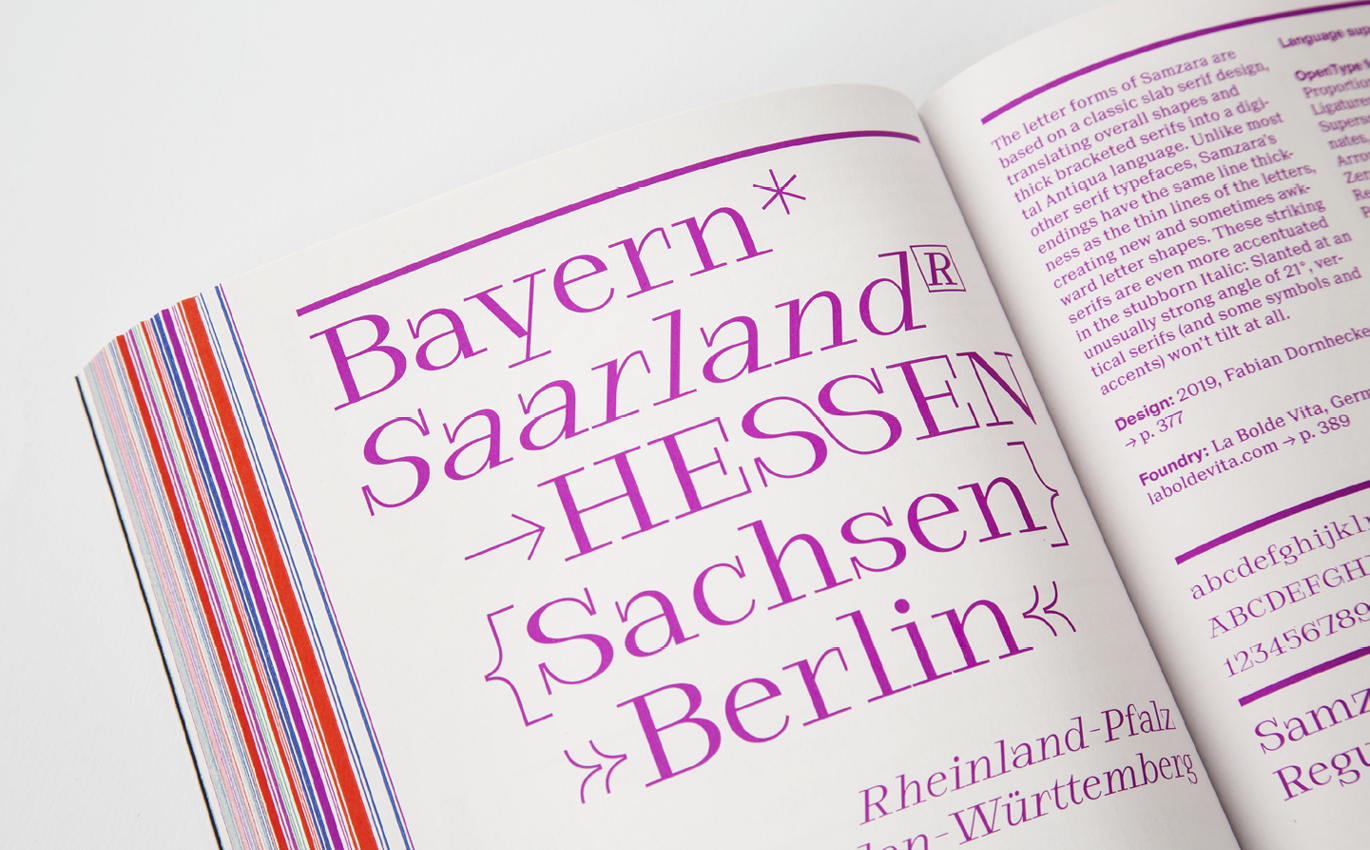
Presentation of the Samzara in the "Yearbook of Type 2019/20" by Slanted
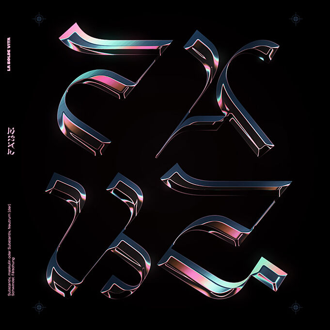
“The oversized serifs are emphasised even more in Italic by consistently resisting the strong slant angle.”
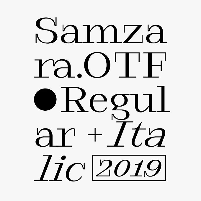
Fabian Dornhecker, Samzara Typeface
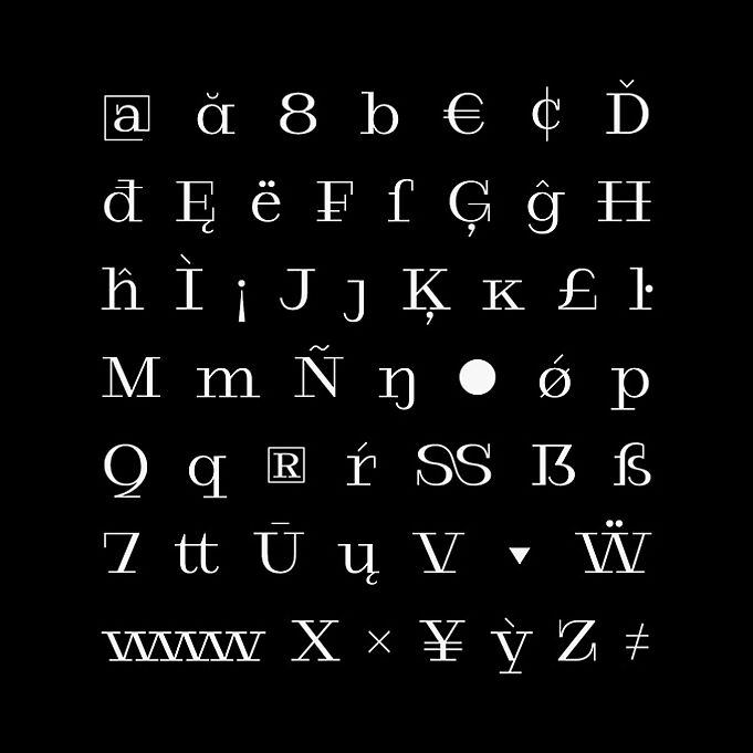

The most important glyphs of the Samzara including alternative forms

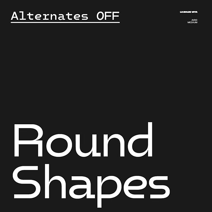
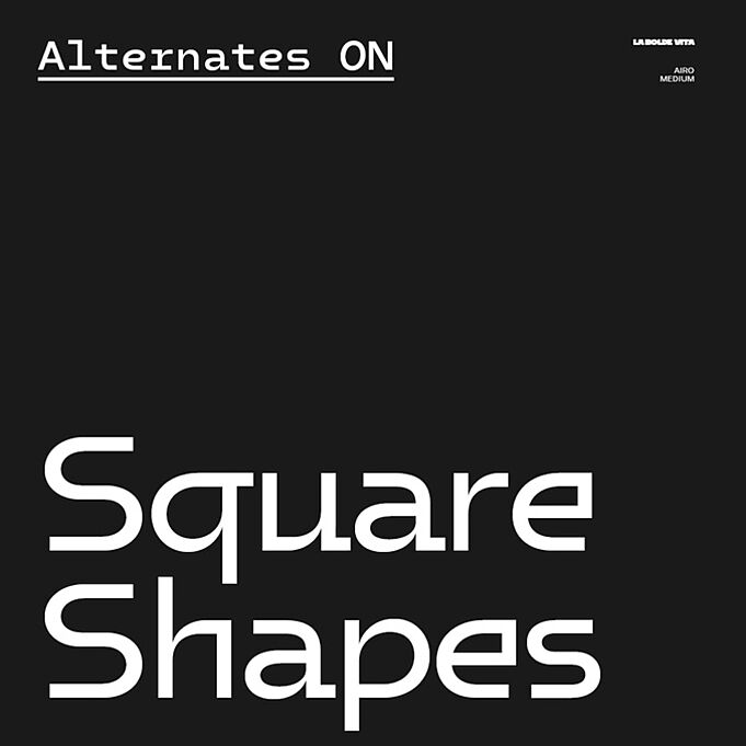
“Dynamic and static are permanent antagonists and merge in the design, the alignment of which can be further adjusted through OpenType features.”
Fabian Dornhecker, Airo Typeface

The Airo font family consists of five bold sizes (Regular, Medium, Bold, Extra Bold, Black), each in a normal version (with variable letter widths) and monospaced (with constant widths).

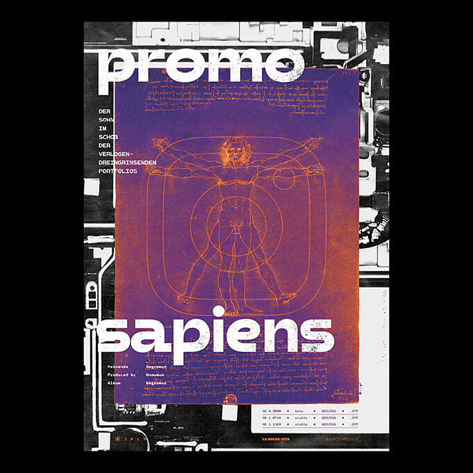
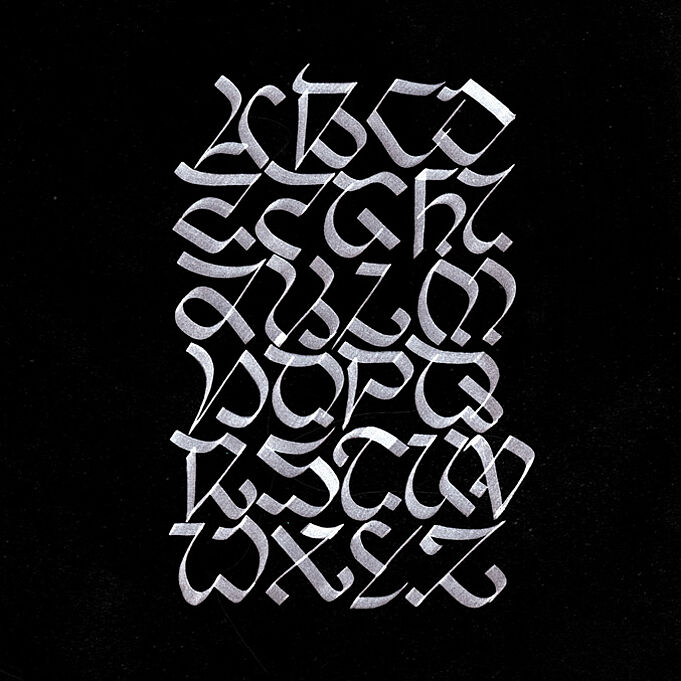
“The visual language is an interplay of calligraphic experiments from a wide variety of eras, brought together in a contemporary guise.”
Fabian Dornhecker, Unzyale Typeface

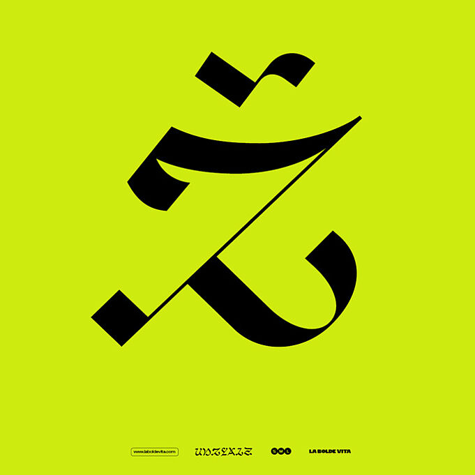
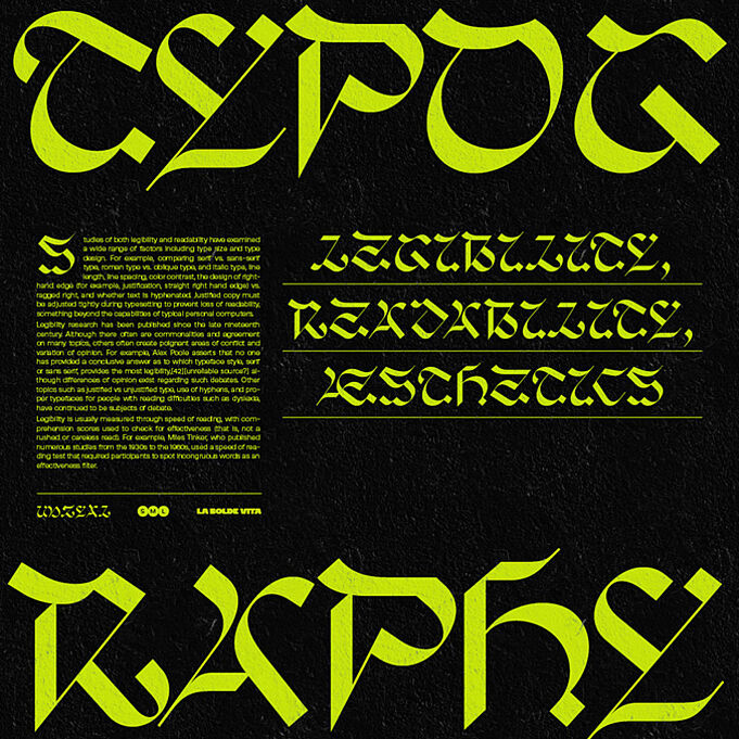
The Unzyale font family is available in three optical sizes (S, M and L) and offers contrast, spacing and shape adjustments for different text sizes
From sketches and analogue writing experiments ...
... to functional type and digital application
