- Barrier-free corporate design
- Design
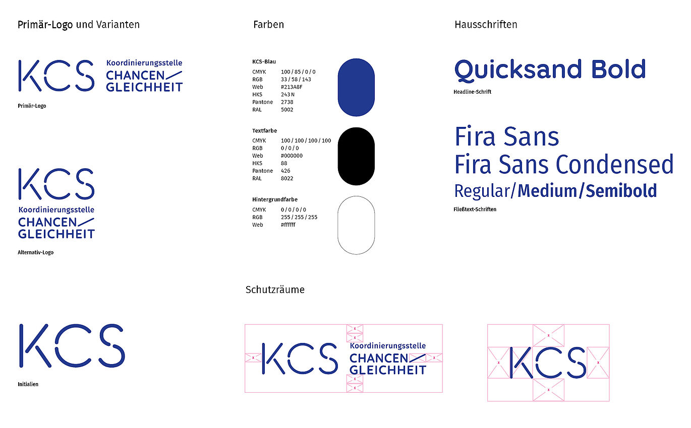
We developed a low-barrier corporate design for the Coordination Office for Equal Opportunities in Saxony by reducing the old design to its core elements and bringing them into focus. Instead of bulky figurative marks, there is now a word mark around the newly introduced KCS abbreviation. This helps the quick, doubtless grasping. Furthermore, we reduce to a strong color, which is used positively and negatively. This ensures high contrast (for people with visual impairments) and more eco-efficient printing conditions. Icon graphics in the style of the logo loosen up the whole. We also place special emphasis on physical tangibility of analog products through natural papers, special colour, cutout and Braille.