- Exhibition Space Typography
- Scenography
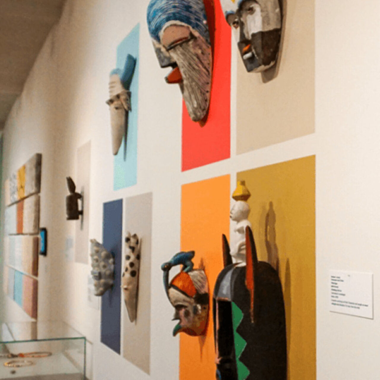
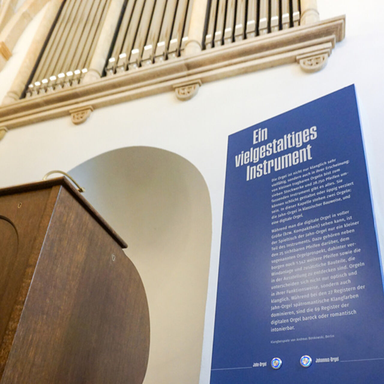
- Exhibition Graphics
In 2017, Alfred Weidinger became director of the Museum der bildenden Künste Leipzig. In the course of this, we were commissioned as contributors for staging exhibition typography. We accompany the conversion from pure collection presentation to exhibition spaces in which works are carefully contextualised with the help of words and images. The aim is to give visitors access to an overall art-historical experience regardless of their prior knowledge.
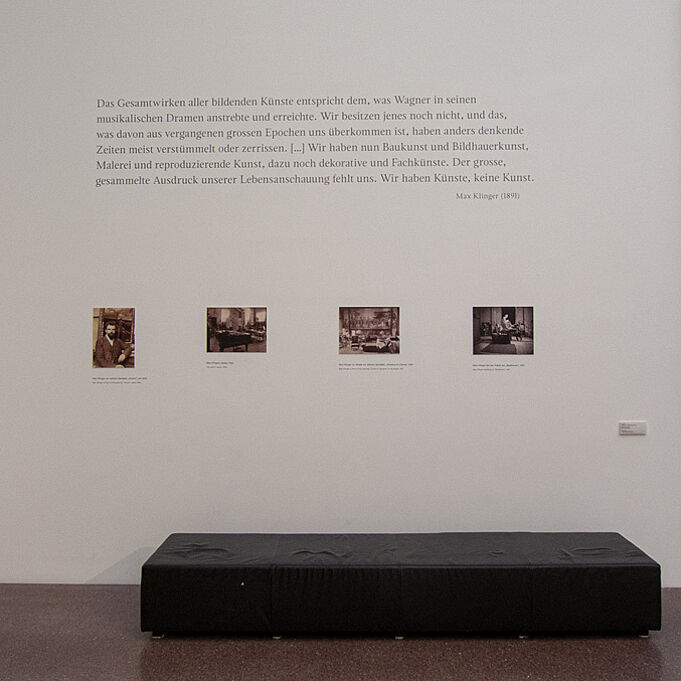
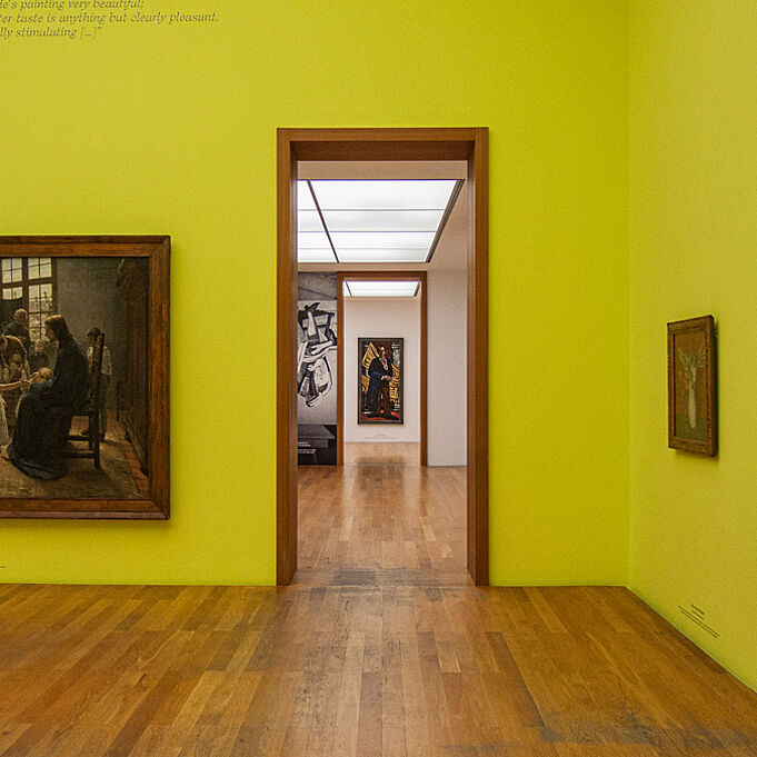
In accordance with the new corporate design guidelines of the museum and taking into account the specific characteristics of the works, we successively implemented the typographic wall designs of the individual permanent exhibition rooms. The typography in the Klinger Hall, for example, was staged in a timelessly elegant manner in order to let his works speak for themselves and to emphasise their everlastingness. Where appropriate, however, the design also includes a chronological classification of the works presented.


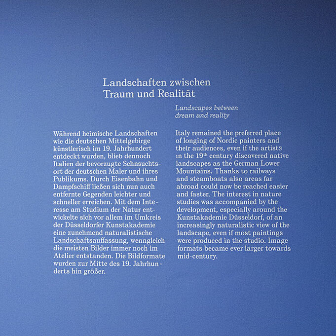
Thus, the Schletter (Romantic) and Classical Modernism collections stand in sensory-aesthetic chronological order through the refined interplay of various graphic means. Works, wall colour, lettering, as well as text and image quotations create holistic spatial experiences and underline art-historical dramaturgies. In these projects, we worked closely with various curators of the house, graphically realising their ideas according to specifications and delegating orders to the producing trades.


Since 2017, we have supported over 20 special exhibitions at the MdbK with staging wall typography. The depth of collaboration varies from project to project - from pure typesetting with subsequent production support to the cooperative creation of work positioning and wall developments with the responsible curators. Our focus is always on underlining the conceptual statement of a special exhibition through the selection of adequate design means.


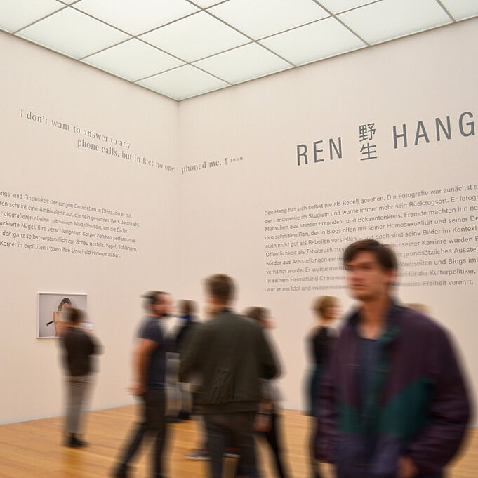
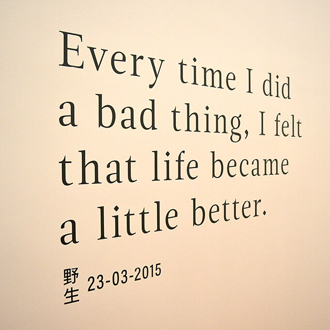
The photography exhibition of the polarising Chinese artist Ren Hang was the world's first show since his suicide, and the first ever special exhibition in the museum in which we were involved. Together with the museum director Alfred Weidinger, we designed wall displays to reflect the poetic-political analogue photographs. Quotes from the artist about his work and the world, as well as compactly informative texts and aesthetic elements hover above or below the mysterious pictorial motifs, gently framing them, recounting their emotions.


For the exhibition of the famous representative of the Leipzig School, we opted for restrained wall typography. Discreetly, work names and lenders are placed mid-axially under the painter's expressive pictures and, thanks to their vertically uniform arrangement, form a discreet and informative band that does not distract attention from the paintings and is nevertheless easily recognisable. This graphic form has since been implemented as a standard work inscription in the museum.


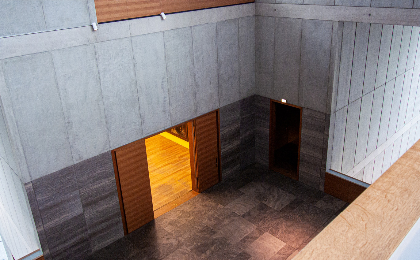
An art museum is contradictory in itself: it is a place of venerable tradition and rapid mobility. Due to their time limits, special exhibitions demand a lot from all those involved. Coordination processes take place on short notice and often under time pressure. Here we have been and continue to be available to our clients in a responsive and flexible manner. At collection presentations we have recognised: The museum works as a whole, not as the sum of its individual parts. The holistic view of rooms that have already been realised and the specific and specific detail requirements of current rooms and exhibits is therefore indispensable.